There are several packages to create a Bar chart in React. But consider the scenario where we want to create a highly specialised Bar chart in one of our pages. In this case, my recommendation is to avoid community packages which are usually bloated with too many features or does not have the feature that we need. In this tutorial, I will show how to create a Bar chart in React using SVG components, D3 functions for math and react-move for animations.
Get Started
Create a new app using CRA (create-react-app).
npx create-react-app barchartapp
cd barchartapp
yarn start
Do the usual cleanup in the newly created app. Remove serviceWorker.js, logo.svg, App.css and relevant dependencies (Commit).
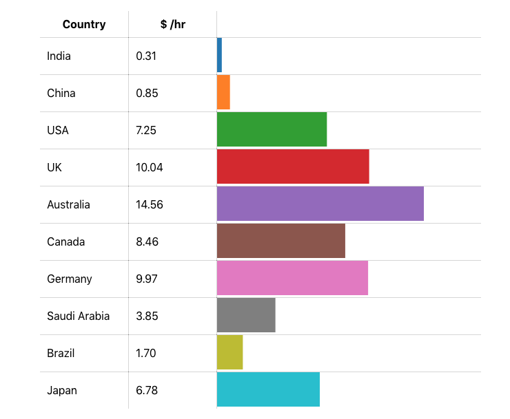
We’re going to plot the minimum hourly wages of major economies in a bar chart. The screenshot of the final product looks like so.

Download the data for the bar chart from here. It is a JavaScript file compiled from publicly available information.
Good looking table
As a first step, we show the data in a table. This is good old React and needs no explaining.
class App extends Component {
  render() {
    return (
      <table>
        <thead>
          <tr>
            <th width="20%">Country</th>
            <th width="20%">$ /hr</th>
            <th></th>
          </tr>
        </thead>
        <tbody>
          {data.map(d => (
            <tr key={d.country}>
              <td>
                {d.country}
              </td>
              <td>
                {d.wages.toFixed(2)}
              </td>
              <td>

              </td>
            </tr>
          ))}
        </tbody>
      </table>
    );
  }
}
Style the table with borders.
table {
  width: 640px;
  border-collapse: collapse;
  margin: 100px;
}

th, td {
  border: 1px solid rgba(0,0,0,.16);
  padding: 10px;
}
Remove the outer border with some more CSS.
th {
  border-top: none;
}

th:first-child {
  border-left: none;
}

th:last-child {
  border-right: none;
}

tr:last-child td {
  border-bottom: none;
}

tr > td:first-child {
  border-left: none;
}

tr > td:last-child {
  border-right: none;
}
With the above code in place, the table looks like so.

Drawing the bar chart
We shall draw the bars in the third column of the table. Each bar is a SVG element with a rectangle within it. The height of the bar is 50px. The width and color of the bar needs computation.
<td>
  <svg height="50">
    <rect width={widthScale(d.wages)} height="50" fill={colorScale(i)} />
  </svg>
</td>
For all computations, we use D3. Install the following packages.
yarn add d3-array
yarn add d3-scale
yarn add d3-scale-chromatic
Import the functions that we need.
import { max } from 'd3-array';
import { scaleLinear, scaleOrdinal } from 'd3-scale';
import { schemeCategory10 } from 'd3-scale-chromatic';
Define scales for width and color. Width is a number and is proportional to the wages in dollars per hour. The range for the minimum wages is between 0 and $14.56 (for Australia). This should be proportional to the width of the bar. The scaleLinear function in D3 does this.
const widthScale = scaleLinear().domain([0, max(data, d => d.wages)]).range([0, 320]);Max function computes maximum value of minimum wages.
max(data, d => d.wages)Input domain for wages ranges from 0 to the computed max value. And the output range is between 0 and 320px. To compute the width of the bar, we call the widthScale function like so: widthScale(d.wages). For a country like India with minimum wages of 0.31$, the width of the bar is widthScale(0.31)which is equal to 0.31 / 14.56 * 320 = 7px.
For colors, we use the scaleOrdinal function.
const colorScale = scaleOrdinal(schemeCategory10);For color palette as provided by schemeCategory10, we use the d3-scale-chromatic package. As the name suggests, there are 10 colors to choose from. To compute the color of the bar, we use colorScale(i)where we pass the index of the bar.
Our chart looks all OK. The one thing missing is the animation. When the chart loads up, we shall animate the bars.
Animation for the bars
My preferred library for doing animations in React is react-move. I like the API in react-move. It is easy to understand and is intuitive. The API works well for animating SVG elements like the width of the bars.
Install react-move first.
yarn add react-moveThe main component for performing the animations is NodeGroup.
import { NodeGroup } from 'react-move';NodeGroup has a few mandatory props: data, keyAccessor and start. It accepts an array as data prop. Since NodeGroup displays an array, it allows retrieving a key for each item that it displays (keyAccessor prop). It then allows the developer to specify the animation state using four functions: start, enter, update, leave. As the name suggests, start prop allows the developer to specify the starting state for the animation. The enter prop allows the developer to specify the state when a new item is added to an array or usually when the component appears for the first time. When there is a change in the data (array), NodeGroup runs the function specified in the update prop to retrieve the new values for the animation state. And finally, when we remove an item from the array, the leave prop specifies a function which retrieves the animation state. The whole idea of all these props is to compute the animation state. And as the animation state changes, the only child within NodeGroup updates itself.
A concrete example will help our understanding of NodeGroup. For our case, we shall animate the width of the bars.
<NodeGroup
  data={data}
  keyAccessor={d => d.country}
  start={d => ({
    width: 0
  })}
  enter={d => ({
    width: [widthScale(d.wages)]
  })}>
  {nodes => (
    <Fragment>
      {nodes.map(({ state, data, key }) => (
        <tr key={key}>
          <td>
            {data.country}
          </td>
          <td>
            {data.wages.toFixed(2)}
          </td>
          <td>
            <svg height="50">
              <rect width={state.width} height="50" fill={colorScale(key)} />
            </svg>
          </td>
        </tr>
      ))}
    </Fragment>
  )}
</NodeGroup>
Our NodeGroup accepts the data array which has the list of countries and their minimum wage in dollars per hour. KeyAccessor prop retrieves the key for each item. And in our case, it is the country name. Then we specify the start and enter functions. The start function is fairly simple. We initially have the width of all bars equal to 0. In the enter function, we use the scale function for width to compute the final animation state when the item first appears.
Within the NodeGroup, we have another function which is continuously run when the animation is in progress. This function renders a component. In our case, we render a Fragment consisting of a list of table rows. Each table row has the country name, minimum hourly wage for the country and a bar. The width of the bar is constantly updated when the animation is in progress. And within the render function, we retrieve the width of the bar by using state.width. The render function also has the original data in another property with the same name – data. Because there are too many properties of the same name (data), this might appear a bit confusing. But the data within the render function specifies a single object within our original array. So, we can retrieve the name of the country using data.country from within the NodeGroup render function.
When we run the app, as the page loads, there is a nice animation for the bar width. Try refreshing the page to see the animation in action. There are various other properties to configure the animation. Please check react-move documentation to play around with it.
Summary
In this tutorial, we learnt how to draw a custom bar chart within a table using SVG elements, D3 function and react-move. We started with displaying the data in a good looking table. Then we plotted all the bars depicting the value of data. And finally, we added some animation when the bars appeared.
The source code is available in a github repository.
As an assignment, try to sort the table by country name or minimum wages. When the user clicks on the column header, sort the data array. And this time, use the update prop in NodeGroup to animate the bars. I will leave it as an exercise to the readers. It is fairly straight-forward.