Bar chart is one of the common chart types widely used in data visualisation. Most of you know about D3 and how D3 is an integral part of your toolset in data visualisation. However, D3 is not for everybody. It provides a low level API to create a SVG. Yes, all charts made in D3 are SVG elements. In this post, we will use D3 in our React app to create just another bar chart.
react-faux-dom
We will use d3 with react-faux-dom. This package provides with a virtual DOM for all our D3 functions. After all DOM manipulations, the virtual DOM element renders as a React element. There are a lot of JavaScript code snippets for D3. This approach will help us to use these code snippets directly in our React app. And there is no need to learn any additional library.
1) Create a new react app, d3bar.
create-react-app d3bar
2) Install d3 and react-faux-dom
yarn add d3 react-faux-dom
3) Modify the App.js to draw a SVG.
import React, { Component } from 'react';
import { Element } from 'react-faux-dom';
import * as d3 from 'd3';
import './App.css';

class App extends Component {
    drawChart() {
        const width = 800;
        const height = 450;
        const el = new Element('div');
        const svg = d3.select(el)
            .append('svg')
            .attr('id', 'chart')
            .attr('width', width)
            .attr('height', height);

        return el.toReact();
    }

    render() {
        return this.drawChart();
    }
}

export default App;
4) In App.css, style the svg element.
#chart {
    background-color: #F5F2EB;
    border: 1px solid #CCC;
}
If you run the app now, you should see a SVG element of size 800 by 450 with a background color set.
Data for Bar chart
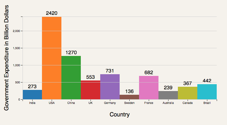
The data for Bar chart is quite interesting. It is the government expenditure of major economies in the year 2016 as found in the World Bank data.
5) Add the data in a separate file, data.js and export it. We will import the data into the App.js component file.
const data = [
    {
        country: 'India',
        value: 273
    },
    {
        country: 'USA',
        value: 2420
    },
    {
        country: 'China',
        value: 1270
    },
    {
        country: 'UK',
        value: 553
    },
    {
        country: 'Germany',
        value: 731
    },
    {
        country: 'Sweden',
        value: 136
    },
    {
        country: 'France',
        value: 682
    },
    {
        country: 'Australia',
        value: 239
    },
    {
        country: 'Canada',
        value: 367
    },
    {
        country: 'Brazil',
        value: 442
    }
];
The value represents the government expenditure in billion dollars (USD).
Coding tasks
With a high level component library, we should expect code like so.
<BarChart data={data} config={config} />
However, D3 exposes a low level API. So, we build the bar chart from the scratch.
- Drawing the bars.
- Printing the value as text label.
- Drawing the axis.
- Printing the axis labels.
- Drawing the gridlines.
As you can see from the coding tasks, we are building each part of the bar chart by drawing into a SVG element. The completed bar chart looks like so.

Drawing the bars
6) We will create a new group element within the SVG element where we will draw the bar chart. The new group element has a margin set. After that, we call a plot function to draw a bar graph on the group.
const margin = {
    top: 60,
    bottom: 100,
    left: 80,
    right: 40
};

const chart = svg.append('g')
    .classed('display', true)
    .attr('transform', `translate(${margin.left},${margin.top})`);

const chartWidth = width - margin.left - margin.right;
const chartHeight = height - margin.top - margin.bottom
this.plot(chart, chartWidth, chartHeight);
7) Within the plot function, we start by creating scales for x and y directions. Our x-axis has a set of countries. And y-axis has the government expenditures. In the x direction, the scale is based on ordinals (discrete values). And in the y direction, the scale is linear (continuous values).
const xScale = d3.scaleBand()
    .domain(data.map(d => d.country))
    .range([0, width]);
const yScale = d3.scaleLinear()
    .domain([0, d3.max(data, d => d.value)])
    .range([height, 0]);
const colorScale = d3.scaleOrdinal(d3.schemeCategory10);
As you can see from the above code, scales are nothing but functions that map a data point (country, value) to a point in the SVG element. The domain is the permitted values for the data point. And range spans from 0 to width. And in y direction from height to 0. In D3, the Y direction increases from top to bottom. But for drawing the chart, we want to draw the bars from bottom to top. So, there is a reversal of direction for the y scales. And the range of the Y scale indicates it. Finally, we have a color scale. D3 comes with a standard color scheme of 10 colors which is denoted by d3.schemeCategory10.
8) Finally, we come to drawing the bars. Bars are nothing but rect elements within SVG. Position the rects using a (x, y) coordinate within the SVG. Also, provide a width and a height to the bars. Color each bar differently using a color from the palette defined in the color scale.
chart.selectAll(".bar")
    .data(data)
    .enter()
    .append('rect')
    .classed('bar', true)
    .attr('x', d => xScale(d.country))
    .attr('y', d => yScale(d.value))
    .attr('height', d => (height - yScale(d.value)))
    .attr('width', d => xScale.bandwidth())
    .style('fill', (d, i) => colorScale(i));
9) Add a custom CSS to the bar class.
.bar {
    shape-rendering: crispEdges;
}
Printing the value as text label
10) SVG has a text element. We will use that to place the government expenditure values on top of the bars. As we did for the bar, provide a (x, y) coordinate value to the text element.
chart.selectAll('.bar-label')
    .data(data)
    .enter()
    .append('text')
    .classed('bar-label', true)
    .attr('x', d => xScale(d.country) + xScale.bandwidth()/2)
    .attr('dx', 0)
    .attr('y', d => yScale(d.value))
    .attr('dy', -6)
    .text(d => d.value);
11) Add some custom CSS to the bar-label class.
.bar-label{
    fill: #000;
    text-anchor: middle;
    font-size: 18px;
}
The text-anchor of middle suggests that we are providing the (x, y) values to the middle of the text. This helps in centering the text exactly within the bar’s width.
Drawing the axis
12) The X axis has the country names. D3 has a few axis generator functions which we can put to use.
const xAxis = d3.axisBottom()
    .scale(xScale);

chart.append('g')
    .classed('x axis', true)
    .attr('transform', `translate(0,${height})`)
    .call(xAxis);
We are giving a class of x and axis to the group element. And then move it to the bottom of the chart using the transform attribute.
13) The Y axis has the government expenditure in billion dollars. Place the axis in the left of the chart.
const yAxis = d3.axisLeft()
    .ticks(5)
    .scale(yScale);

chart.append('g')
    .classed('y axis', true)
    .attr('transform', 'translate(0,0)')
    .call(yAxis);
We specify a class of y and axis. Further, we specify the number of ticks. The number of ticks is only a recommendation. For this chart, using a tick size of 5, 6, 7 did not make any change to the Y axis.
14) Finally, we add custom CSS to the axis class.
.axis path,
.axis line {
    fill: none;
    stroke: #000;
    shape-rendering: crispEdges;
}
Printing the axis labels
Another good thing to do is to print the axis labels. This is a text that denotes what each axis means.
15) For the X axis, print Country as the axis label.
chart.select('.x.axis')
    .append('text')
    .attr('x',  width/2)
    .attr('y', 60)
    .attr('fill', '#000')
    .style('font-size', '20px')
    .style('text-anchor', 'middle')
    .text('Country');
16) For the Y axis, print “Government expenditure in Billion Dollars” as the axis label.
chart.select('.y.axis')
    .append('text')
    .attr('x', 0)
    .attr('y', 0)
    .attr('transform', `translate(-50, ${height/2}) rotate(-90)`)
    .attr('fill', '#000')
    .style('font-size', '20px')
    .style('text-anchor', 'middle')
    .text('Government Expenditure in Billion Dollars');
The only detail about the Y axis is the transformation we apply. We first move the axis to the right position and then rotate it by 90 degrees.
Drawing gridlines
We are almost done with the chart. Only one final detail. Let us draw some gridlines to make the chart look good.
17) Gridlines are similar to ticks on the axis. The only difference is that these ticks extend across the entire width of the chart.
const yGridlines = d3.axisLeft()
    .scale(yScale)
    .ticks(5)
    .tickSize(-width,0,0)
    .tickFormat('')

chart.append('g')
    .call(yGridlines)
    .classed('gridline', true);
18) Finally, style the gridline class with some CSS.
.gridline path,
.gridline line{
    fill: none;
    stroke: #ccc;
    shape-rendering: crispEdges;
}
That is all to drawing a bar chart with D3. The complete source code is available in a git repo.
UPDATE: If you like this post, you may enjoy reading: Do we need D3 for React?
can we add line on chart showing average please add scroll to the chart