This tutorial shows how to implement drag and drop using react-dnd. The official tutorial is a bit long. So, I created a simpler app to illustrate how to integrate react-dnd in your apps. There is a github repository for this tutorial.
Overview of Drag and Drop support in browsers
There are two elements on which we write event handlers: the drag element and the drop element. The drag element is usually an item that we drag. When the drag element is over the drop element, there is some visual indication that we can drop the element over there. Then, we drop the dragged element within the drop element. Usually, the dragged element is rendered within the drop element.
The steps to implement Drag and drop using plain browser API is as follows:
- Mark an element as draggable by setting the draggable attribute to true.
- Handle the “ondragstart” event on the drag element. Pass some data to the drag event that will be available when we drop the element.
- Handle the “ondragover” event on the drop element. In this element, we check if the drag event has relevant data. If data is available, then we cancel the event by calling “event.preventDefault()”. This is a bit confusing. So, I will explain a bit. The default behaviour is to prevent the drop action. By calling preventDefault on the drag event, we tell the browser that the element is droppable. In this event handler, we implement any style changes to indicate that the element is droppable.
- Handle the “ondrop” event on the drop element. This event handler retrieves the data from the drag event and calls appropriate functions to render the drag element within the drop element.
- Handle the “ondragleave” event on the drop element. In this event handler, we reset any style that indicates that the dragged element is over the drop element.
The react-dnd package provides a simple API to implement drag and drop. We don’t have to write so many event handlers. Instead, we use the useDrag and useDrop hooks that react-dnd provides us.
App Overview
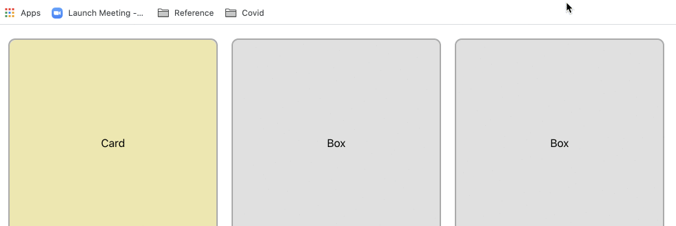
In this tutorial, we are going to draw three boxes and a card. The app allows you to drag and drop the card into any of the three boxes. The steps to create the app are:
- Add react-dnd to the project
- Setup DndProvider
- Components for Box and Card
- Add drag support
- Add drop support
A) Create react app
Create a new react app using
npx create-react-app dnd-demoAdd the following packages to your project.
yarn add react-dnd react-dnd-html5-backendFor web projects, we use react-dnd-html5-backend. This does not have touch support. For touch support, the package is react-dnd-touch-backend
B) Setup DndProvider
The first step is to set the DndProvider. DndProvider is a package that handles DOM events and translates it into internal Redux actions that react-dnd understands.
In index.js, import the following.
import { DndProvider } from "react-dnd";
import { HTML5Backend } from "react-dnd-html5-backend";
Wrap the App component with the DndProvider.
ReactDOM.render(
  <React.StrictMode>
    <DndProvider backend={HTML5Backend}>
      <App />
    </DndProvider>
  </React.StrictMode>,
  document.getElementById("root")
);
C) Components for Box and Card
App component has three boxes and one card. In App.js, modify the App component like below.
function App() {
  return (
    <div className="app">
      <Box card />
      <Box />
      <Box />
    </div>
  );
}
Both Box and Card components are simple. We don’t have to create separate files for it. Include the following code in App.js.
function Card() {
  return <div className="card">Card</div>;
}

function Box({ card }) {
  return <div className="box">{card ? <Card /> : "Box"}</div>;
}
If Box has a card, it embeds the Card component. Otherwise, it displays some text.
Add the following styles in App.css.
.app {
  display: flex;
  margin: 20px;
}

.box {
  width: 300px;
  height: 300px;
  display: flex;
  justify-content: center;
  align-items: center;
  background-color: rgba(0, 0, 0, 0.12);
  border: 2px solid rgba(0, 0, 0, 0.24);
  margin-right: 20px;
  border-radius: 10px;
}

.card {
  width: 100%;
  height: 100%;
  display: flex;
  justify-content: center;
  align-items: center;
  background-color: palegoldenrod;
  border-radius: 10px;
}
D) Add Drag Support
The next step is to add drag support to the card component. Import useDrag hook from react-dnd.
import { useDrag } from "react-dnd";Within card component, call the useDrag hook like so.
  const [{ isDragging }, dragRef] = useDrag(() => ({
    type: "card",
    collect: (monitor) => ({
      isDragging: monitor.isDragging(),
    }),
  }));
The useDrag hook accepts a function that returns an object. The object should return the item type. In our example, we have only one draggable item type that we can name ‘card’. The collect key is more interesting. It accepts a monitor object that indicates the current state of drag and drop. In our example, we check if the card is being dragged. We set that to the isDragging prop in our component. Now, it is time to use the result of the hook within our card component.
return (
    <div
      className="card"
      ref={dragRef}
      style={{
        backgroundColor: isDragging ? "#fbb" : "palegoldenrod",
      }}
    >
      Card
    </div>
  );
We indicate that a component is draggable by specifying the ref property on the component. Here we assign dragRef to the div component representing the card. We also change the background color of the Card component when it is being dragged.
E) Add Drop Support
Next, we add drop support to the Box component. When the user drops a card to the Box, the card moves to that Box. For implementing drop support, we use the useDrop hook.
import { useDrag, useDrop } from "react-dnd";Call the useDrop hook from the Box component.
  const [{ isOver }, dropRef] = useDrop(() => ({
    accept: "card",
    drop: () => moveCard(),
    collect: (monitor) => ({
      isOver: monitor.isOver(),
    }),
  }));
useDrop hook accepts a function that returns an object with three keys. The accept key specifies the item type that can be dropped into the box. For our simple example, we accept the “card” item type that we specified earlier in the useDrag hook.
The second key is a drop function that gets triggered when an item is dropped. For our example, we call the moveCard function that moves the card to the appropriate box.
The third key is the collect function. Here, we check the state of the drag and drop action with the monitor object. If the card is over the box, we set the isOver prop to “true”.
We use the result of the useDrop hook in the Box component as follows.
return (
    <div
      className="box"
      ref={dropRef}
      style={{ backgroundColor: isOver ? "#bbf" : "rgba(0,0,0,.12" }}
    >
      {card ? <Card /> : "Box"}
    </div>
  );
Assign the ref prop to the box component. And change the background color if the card is over the box.
Finally, we make some changes to the App component to handle the drop action.
function App() {
  const [index, setIndex] = useState(1);

  function moveCard(i) {
    setIndex(i);
  }

  return (
    <div className="app">
      <Box card={index === 1} moveCard={moveCard.bind(null, 1)}></Box>
      <Box card={index === 2} moveCard={moveCard.bind(null, 2)}></Box>
      <Box card={index === 3} moveCard={moveCard.bind(null, 3)}></Box>
    </div>
  );
}
We have a new state – index which indicates the box index where the card is present. Also, we set the moveCard prop for each of the Box component. The moveCard function is very simple. It sets the index of the Box which has the Card.
With the following changes, we have implemented Drag and Drop support to our app.

The complete source code is available in the Git repo.
Thanks for this. Very helpful.