Theme UI (theme-ui) is a library for styling React components using a customisable theme object. It is easier to get started with theme-ui rather than explaining it. In this article, we will cover the following topics:

  • Getting started with theme-ui
  • Defining fonts and colors
  • Variants for heading, button, etc
  • Responsive breakpoints and Media queries
  • Dark mode

We will build a sample app using theme-ui.…

Read More

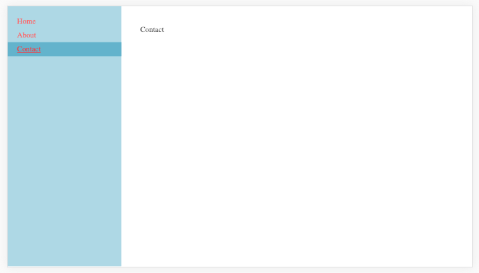
Most people use community packages to do something as trivial as setting up a Menu on a sidebar. In my opinion, it takes more time to understand the API of a package than it takes to build the Menu from scratch. In this tutorial, I will show how you can build your own Menu using React router and SASS.

Scaffold a React app

For scaffolding a React app, please feel to use create-react-app (CRA) or Parcel.…

Read More

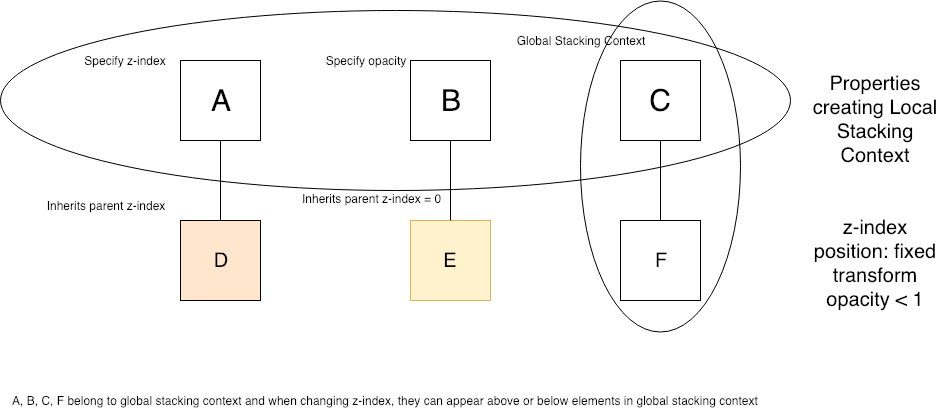
HTML elements can optionally have relative, absolute and fixed positions. Absolute positioning adjusts the position of an element with respect to its nearest parent container which has relative position. If there are no parents with relative position, an element with absolute position is placed within the browser window using the top, left, right or bottom properties. An element with fixed position is always positioned within the browser window.…

Read More

Styled components is the new rage in the world of React. It allows to define components with accompanying style like below.

const Button = styled.a`
  display: inline-block;
  border-radius: 3px;
  padding: 0.5rem 0;
  margin: 0.5rem 1rem;
  width: 11rem;
  background: transparent;
  color: white;
  border: 2px solid white;
`

The above code defines a Button component which is styled based on a link element.…

Read More